Back to Website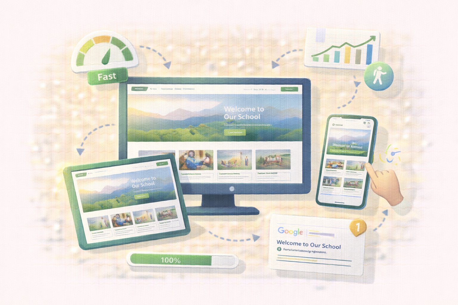
Website
Mobile Responsive
Looks great on phones, tablets, and desktops. Fast loading on any connection.
Key Features
Responsive Design
Pages automatically adapt to any screen size. Perfect viewing experience on phones, tablets, and desktops.
Fast Loading
Optimized images and code for quick page loads. Visitors don't wait—pages load in seconds.
Touch-Friendly
Navigation and buttons designed for mobile use. Easy tapping and scrolling on touchscreens.
SEO Optimized
Built-in search engine optimization for better visibility. Help prospective families find your school on Google.
Accessibility Compliant
Designed to meet accessibility standards. Inclusive design for all visitors.
Built for Everyone
For Parents
- Browse the school website easily from any device
- Check information on the go
- Fast loading even on slower connections
For Marketing Teams
- Reach visitors wherever they are—home, office, or on the go
- Ensure consistent branding across all devices
- Track visitor engagement across platforms
For Search Rankings
- Fast, mobile-friendly sites rank higher in Google
- Better SEO means more prospective families find you
- Modern design signals a modern school